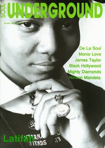
In my second draft I didn't change very much. I switch just the colour and change the names from the band who are include in the magazine. But I left a big identifying feature, so that you will know which band it is after reading the band names.
Montag, 17. März 2014
Second Draft of Content Page
In my second Draft I complete my exercise and fixed all points what I should improve. It got just one negative point. There is no colour. Despite the often sampling i couldn't change the without to ruined my picture. Whatever! I added a description under the title. Another point is that I change the picture in the middle because there couldn't see anything on the picture. But this make no different because the new one picture looks very similar to the old one picture. On top of everything I added a little bit advertising below there.
Mittwoch, 12. März 2014
First Draft of Content Page
My Content Page is actuell made by Microsoft Power Point. So is the quality from the picture not very well. The reason for this move was that i got no any other system to make magazin content page or anything else. Whatever! In my first draft is no any colour althought i tryed to change that. Depite I tryed to change the colour its looked always more terrible how without colour because the letters became invisible. Whatever! My focus group said to the picture that the Headlines needs some descriptions. In addication should the picture beeing filled up with more textes pictures and any other things.
Mittwoch, 5. März 2014
Draft Plan - Content Page
I made a draft plan about my coming content page and I thought that it should be are easy and clearly. I want make at each angle from the content page a picture. In addication i want create a nice background.
First Draft of Front Cover
I decided me to make a another picture because my target audience mean that my Flat plan picture looks a little bit to despleasing. So i change my planes and i made a normal rock'n roll picture. Cool, airy and easy.
I made my Front Cover with no colours because it suit to the Rock'n Roll. Than I took all usually things on the front cover how the prize, barcode, the date, some text about the Guy on the pictures and extra features.
I made my Front Cover with no colours because it suit to the Rock'n Roll. Than I took all usually things on the front cover how the prize, barcode, the date, some text about the Guy on the pictures and extra features.
Mittwoch, 26. Februar 2014
Flat Plan - front page
This is a metal-magazine. There's just one picture on the front cover. A Rockstar with a T-Shirt, where stay the sentence:" I love me.". He hold a vodka bottle in his right hand and crying:" Fuck the police.". Below the cover stay some information about the rockstar in the middle. The draw look really bad, because my draw-skills aren't good.

Montag, 3. Februar 2014
Questionnaire
I had prepare a questionnaire about a music magazines to see what the target audience wants and wants not. In that questionnaire stayed some question how "how much do would spend for a music magazine?" or "What kind of music do you like?".
What kind of music do- you like?
Rock
RNB
House
How much do you would spend for a music magazine?
3x 1,50-3£
How many pictures do you want see on a music front magazine?
5, 5, 17
What do you want read in a music magazine?
Latest news on hands
Interviews
artist information (and Toms details)
What do you hate to read in a music magazine?
Girly gossip
repetitive information
adverts
What kind of colours do you prefer on a music front magazine?
Red, black, blue and white
Black and red
Pink, light green and lilac
Sonntag, 26. Januar 2014
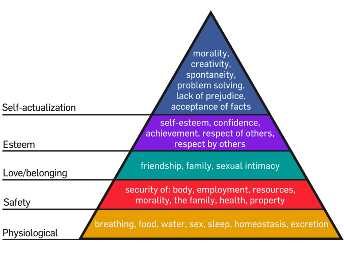
Marlow's hierarchy of needs
An interpretation of Maslow's hierarchy of needs,
represented as a pyramid with the more basic needs at the bottom
 Psysiological needs are the physical requirements for human survival. If these requirements are not met, the human body cannot function properly and will failing. Physiological needs are thought to be the most important; they should be met first. Air, water, and food are metabolic requirements for survival in all animals, including humans. Clothing and shelter provide protection from the elements. While maintaining an adequate birth rate shapes the intensity of the human sexual instinct, sexual competition may also shape said instinict
Social Class Classification
in the market research there are diffirenz ways, to analys his company's research audience target. There exist a lot of ways but the best way is the social class classification
The grades are usually grouped as ABC1 and C2DE.
The different groups are divided under classes. C2DE is rebellious and individual during ABC1 is prime.
I would take C2DE for my music magazine because Dupstep is my favourite music.
Donnerstag, 23. Januar 2014
Analysis of second Double Page Spreads
-the guy of the picture is created
-they guy make cool symbols with his hand which suits the house styl of the hip hop
-below are the symbols from the sponsored
-right below is the date of appareance
-right high is a dictum
-writing is small but good to read
Dienstag, 21. Januar 2014
Analysis of first Double Page Spreads
DPS 1
-Large title which explains the topic of the double page spread. Furthermore lets the reader know what he/she will be reading.
- On the rights side is a picture from kanye west where stay:" talks to wired"
- On the left side stay a long text and a sentence in french
- The background is white and looked a little bit boring
Montag, 20. Januar 2014
Analysis of 2 Content Pages Magazines

1 Content Page
- Clearly marked out and there stay all essential things inside what a content page need
- headline is huge, conspicuos and looked really good
- Picture in the front about people whose stay there the page number about these person to know more about him/here
- Below the Content page stay a letter from the producer this magazin to the reader

2 Content Page
- This content page has 2 pages and a lot of informations about the content from this magazin
- advertising below, on the left page
- Picture about people overall where stay the page number about these person to know more about him/here
- on the left page on offer some features that stay in the magazin.
Dienstag, 7. Januar 2014
History of Music Magazines
Music Magazines support the artist musicer by the writting about this people. In addition they give some information to the fans from the artist. I have maked a list about some british music magazines:
area: rock and metal
created in 6. june 1981
Hip Hop Connection
Kerrang
Frequency : every weekarea: rock and metal
created in 6. june 1981
Hip Hop Connection
Frequency: every week
created: 1988
editor: Andy Cowan
Metal Forces
Frequency: every week
created in 1983
Editor: Bernard Doe
Soul Underground
Frequency: every month
area: dance music
Editor: David Lubich
created in 1987
Classical Music
Frequency: Fortnighty
Editor: Kimon Daltas
created in 25. September 1976
Clash
Editor: Simon Harper
Frequency: every month
created in 2004
Songlines
Editor: Simon Broughton
Frequencz: 8 times a year
created in 1999
Computer Music
Editor: Lee Du-Caine
Frequency: every month
created in 1998
Analysis of two music magazines
Rolling Stone:
Of this front magazine we see a big gangster black guy who is overall full with tattoos and without T-Shirt. In the central from the cover we see his name: Rick Ross. Gangster of Love. The background from the front cover ist white and the writings are white, Yellow, Red, Grey and black. The writings are looking groovy and is convenient too the styl from the magazin. The guy of the cover looked very crazy and is convenient too the styl from the magazin. Tattoos, silver watches, silver chains, black glasses.
Britain's Best Classical Music Magazine: Of front cover it is obviously that there show just classical music. In the front we see a girl who looked in direct in the camera. She hold a violin in her hand. She wear white clothes and wear nice teeths. The baickground is white and the writting is just in red oder white. Of the front cover we see no any advertising. This is a good point. But there stay no any content of the front cover. There stay just wait in the magazin is a free CD and the name from the girl who there can see of the front cover
Abonnieren
Kommentare (Atom)


.jpg)


